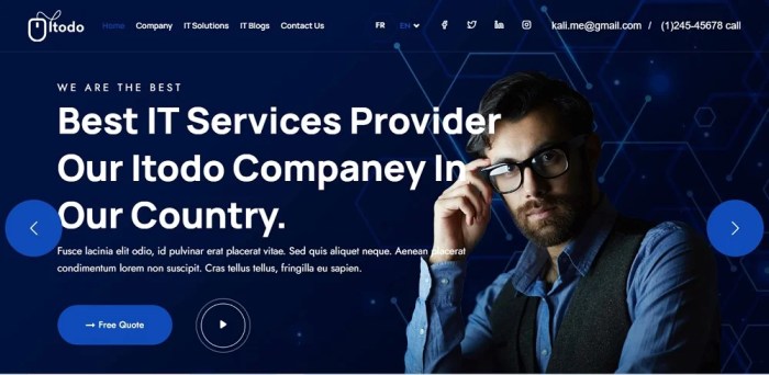
Website Design Ideas kick off the creative process with fresh layout designs, responsive strategies, and white space magic, perfect for navigating the digital world with style.
From color schemes to typography, navigation, and multimedia integration, this guide will amp up your website game in no time.
Website Design Ideas

In the world of website design, creativity and functionality go hand in hand. Here are some innovative layout designs for a homepage that can make your website stand out from the crowd.
Innovative Layout Designs
- Parallax Scrolling: Create a dynamic and engaging user experience by incorporating parallax scrolling effects that add depth to your homepage.
- Split Screen Layout: Divide your homepage into two sections to showcase different content or products, providing a visually appealing and organized look.
- Minimalist Design: Embrace simplicity with a clean and minimalist layout that focuses on essential elements, creating a modern and sophisticated aesthetic.
Importance of Responsive Design
Responsive design is crucial in today’s digital landscape, where users access websites from various devices. It ensures that your website adapts seamlessly to different screen sizes, providing a consistent and user-friendly experience across desktops, tablets, and smartphones.
Utilizing White Space
White space, also known as negative space, plays a vital role in enhancing readability and user experience. By incorporating ample white space around content and elements, you can create a sense of balance, improve comprehension, and guide users’ focus on essential information.
Color Schemes and Typography
When it comes to website design, color schemes and typography play a crucial role in creating a visually appealing and engaging user experience. The right combination of colors and fonts can evoke specific emotions, convey brand identities, and enhance overall aesthetics.
Color Schemes
Color psychology is a powerful tool in web design. Here are some examples of color schemes and the emotions they can evoke:
– Blue: Trust, professionalism, calmness
– Red: Energy, passion, urgency
– Green: Growth, health, nature
– Yellow: Happiness, optimism, warmth
– Black: Elegance, sophistication, power
Typography Choices
Typography is not just about choosing a font; it’s about creating a harmonious visual hierarchy that guides the user through the content. The impact of typography choices includes:
– Readability: Choose fonts that are easy to read on various devices.
– Personality: Fonts can convey the tone and personality of your brand.
– Consistency: Maintain a consistent typography style throughout the website for a cohesive look.
Pairing Fonts
Pairing fonts is an art that can enhance the overall aesthetics of your website. Some best practices for pairing fonts include:
– Contrast: Pair a serif font with a sans-serif font for a balanced look.
– Hierarchy: Use different font weights and sizes to create a visual hierarchy.
– Complement: Choose fonts that complement each other in style and tone.
Navigation and User Experience: Website Design Ideas

In the world of website design, navigation plays a crucial role in determining the overall user experience. A well-thought-out navigation structure can make it easy for users to find what they are looking for and navigate through the website seamlessly.
Different Navigation Structures
- Top Navigation: This is a common navigation structure where the menu is placed at the top of the website. It is ideal for websites with a few main sections.
- Side Navigation: Side navigation is displayed on the left or right side of the website, offering a hierarchical structure for easy navigation.
- Hamburger Menu: This is a popular choice for mobile websites, where the menu is hidden behind a button and expands when clicked.
Tips for Optimizing User Experience, Website Design Ideas
- Keep it Simple: Avoid cluttering the navigation with too many options. Stick to the essential sections to avoid overwhelming the users.
- Clear Labels: Use descriptive labels for navigation items to help users understand what each section is about.
- Consistent Design: Maintain consistency in design elements like color, font, and placement to create a cohesive navigation experience.
Importance of Mobile-Friendly Navigation
- Responsive Design: Ensure that your navigation is optimized for mobile devices to provide a seamless experience across all screen sizes.
- Finger-Friendly Design: Make sure that navigation elements are easy to tap on touchscreen devices for improved usability.
- Mobile-First Approach: With the increasing use of mobile devices, prioritizing mobile-friendly navigation is crucial for reaching a wider audience.
Multimedia Integration
In today’s digital age, incorporating multimedia elements like videos, animations, and image galleries into website design has become essential for engaging users and enhancing visual storytelling. Interactive elements such as sliders and carousels also play a crucial role in keeping visitors interested and increasing user engagement.
Incorporating Videos and Animations
Videos and animations can bring a website to life, capturing the attention of users and conveying information in a dynamic and engaging way. Whether it’s a product demo, a tutorial, or a brand story, videos can effectively communicate messages and create a memorable experience for visitors. By integrating animations, such as loading screens or interactive graphics, websites can add personality and interactivity, making the user experience more enjoyable and immersive.
Enhancing Visual Storytelling with Image Galleries
Image galleries are a powerful tool for showcasing products, services, or visual content in a visually appealing way. By arranging images in a gallery format, websites can create a narrative, guiding users through a story or highlighting key features. Whether it’s a portfolio, a travel blog, or an e-commerce site, image galleries can evoke emotions, create a sense of discovery, and leave a lasting impression on visitors.
Impact of Interactive Elements
Interactive elements like sliders and carousels offer a dynamic way to present content and engage users. By allowing users to interact with the website, sliders and carousels enable them to explore information at their own pace, discover new content, and stay engaged. Whether it’s showcasing products, promotions, or testimonials, interactive elements can increase user interaction, improve navigation, and enhance the overall user experience.


