Creating Infographics is all about bringing your data to life in a visually appealing way that grabs attention and conveys information effectively. From choosing the perfect color scheme to mastering typography, this guide will help you become a pro in infographic design.
Get ready to dive deep into the world of infographics and unleash your creativity like never before.
Introduction to Creating Infographics

An infographic is a visual representation of information or data designed to make complex concepts easier to understand. Its purpose is to communicate information quickly and clearly through the use of graphics, charts, and minimal text.
Using infographics in communication has several benefits, including increased engagement, better retention of information, and the ability to simplify complex ideas. Infographics are also more shareable on social media platforms, making them a valuable tool for digital marketing.
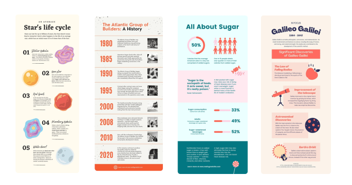
Examples of Successful Infographics and Their Impact
Here are some examples of successful infographics that have made a significant impact:
- An infographic on the benefits of exercise, with colorful visuals and statistics, increased awareness about the importance of physical activity.
- A timeline infographic showcasing the history of a company helped to establish credibility and brand authority.
- A comparison infographic between different smartphone models helped consumers make informed purchasing decisions.
Design Principles for Infographics
Visual hierarchy is crucial in infographics as it helps guide the viewer’s eye through the information presented. By using different sizes, colors, and fonts for elements, you can prioritize what is most important and create a clear flow of information.
When choosing a color scheme for infographics, it’s essential to consider the emotions and associations different colors evoke. For example, warm colors like red and orange can grab attention and convey energy, while cooler colors like blue and green can create a sense of calm and trust. It’s also important to ensure there is enough contrast between colors to make the information easily readable.
Typography plays a significant role in creating effective infographics by setting the tone and style of the content. Choosing the right fonts can enhance readability and reinforce the overall message of the infographic. It’s crucial to use a hierarchy of fonts, including headings, subheadings, and body text, to create a visually appealing design that guides the viewer through the information seamlessly.
Data Collection and Analysis for Infographics
When it comes to creating infographics, data collection and analysis play a crucial role in presenting information in a visually appealing and informative way. By utilizing effective methods for gathering data, analyzing it, and presenting complex information in a clear manner, you can create compelling and engaging infographics that effectively communicate your message.
Exploring methods for collecting data to use in infographics involves gathering information from various sources such as research studies, surveys, reports, and credible websites. It is important to ensure that the data collected is accurate, reliable, and relevant to the topic you are addressing in your infographic. By conducting thorough research and gathering data from reputable sources, you can create infographics that are informative and trustworthy.
Analyzing and interpreting data for visualization requires the ability to identify key insights, trends, and patterns within the data. By utilizing data visualization tools and techniques, you can transform raw data into visually engaging graphics that effectively communicate your message. Whether it’s creating charts, graphs, or diagrams, analyzing data for visualization involves highlighting important information and presenting it in a visually appealing way.
To present complex data in a clear and concise manner, it is important to focus on simplifying information and organizing it in a logical and easy-to-understand format. By breaking down complex data into smaller, digestible chunks, you can make it more accessible to your audience. Utilizing visual elements such as icons, color coding, and typography can also help in presenting complex data in a visually appealing way that is easy to comprehend.
Tips for Presenting Complex Data
- Use visual elements such as charts, graphs, and diagrams to present data in a clear and concise manner.
- Focus on simplifying complex information by breaking it down into smaller, easily digestible chunks.
- Utilize color coding and typography to highlight key points and make the data more visually engaging.
- Ensure that the design of your infographic complements the data and enhances the overall message you are trying to convey.
- Seek feedback from others to ensure that your infographic effectively communicates the intended message and is easy to understand.
Tools and Software for Creating Infographics

Creating visually appealing infographics requires the right tools and software that offer a range of features to bring your data to life. Let’s explore some popular options and provide tips for beginners on selecting the right tool for their infographic design needs.
Popular Tools for Designing Infographics
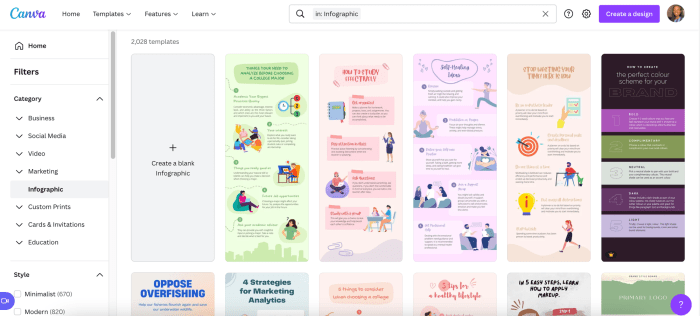
- Canva: A user-friendly platform with drag-and-drop functionality, a wide variety of templates, and design elements to customize your infographics.
- Adobe Illustrator: A professional graphic design software offering advanced features for creating intricate and detailed infographics.
- Piktochart: An online tool with easy-to-use templates and customization options for beginners to design eye-catching infographics.
- Visme: Allows for interactive infographics and offers a library of icons, images, and charts to enhance your designs.
Comparing Features of Different Infographic Design Platforms
- Canva vs. Adobe Illustrator: Canva is more user-friendly for beginners, while Adobe Illustrator provides advanced tools for professional designers.
- Piktochart vs. Visme: Piktochart is simpler to use with pre-designed templates, whereas Visme offers more interactivity options for engaging infographics.
Tips for Beginners on Selecting the Right Tool, Creating Infographics
- Consider your design skills: Choose a tool that matches your expertise level, whether you’re a beginner or a seasoned designer.
- Explore templates: Look for platforms with a variety of templates to kickstart your infographic design process.
- Review features: Compare the features of different tools to ensure they align with your design goals and requirements.
- Take advantage of free trials: Many infographic design platforms offer free trials, allowing you to test out the tool before committing.


